
As the lingering housing boom of the last half-decade continues, the debate about residential property continues, at a public, regulatory and commentariat level. Most of the debate is tied up in questions of supply – “there isn’t enough”, and affordability – “it costs too much”.
However, some research that cuts beyond populism and deals with the underlying economics suggests that both these widely held views may be incorrect. The next sequence of items in this edition of Statistics Count addresses the housing market and some of the little discussed but compelling research and analysis.
We have done them justice here, but as the ABC’s business reporter Michael Janda has commented recently ‘Housing analysis is an inexact science’. It seems there are at least as many views as there are commentators.
The following list provides hyperlinks to each of the relevant items:
- Australia is over-supplied with housing
- Housing approvals down 8.1% year-ending MayHousing approvals down 8.1% year-ending May
- Housing is too cheap?
- Australians suffering less mortgage stress, but its all in the interest rate
A. Australia is over-supplied with housing
Few arguments have been easier to make over the last decade than the proposition that under-supply of housing has forced prices up, to the point where many people are squeezed from the market. It makes sense to apply classic demand and supply dynamics to come to the conclusion.
But the theoretical intersection between demand and supply at a perfect point called price is just that – a theory. And some expert analysts and commentators question the application of the theory to housing, and they point to a considerable body of evidence to do so.
Starting with the ABC’s Michael Janda, he comments that:
“Stronger population growth might have dented the surplus I found when I interrogated dwelling construction versus population growth figures two years ago.
“But no. Australia still has a massive dwelling surplus nationally.”
Janda uses the simple equation of multiplying the population growth by 25% to account for intentionally vacant dwellings (eg. Holiday homes and the like) and demolitions, and dividing that by the average household size defined in the 2016 Census (2.5 persons). The yield from this analysis is shown in the chart below.
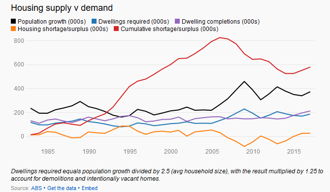
There are constraints with this data. It could be that at the starting point in 1982, there was a massive pent-up demand, and we are still playing catch-up. But there is no real suggestion that is the case.
Janda points to work by Saul Eslake that shows Australian housing supply increased way ahead of population from the end of the Second World War, although we note, the output in the chart below does not deal with demolitions and so represents a gross additional housing volume.
Similarly, Core Logic’s Cameron Kusher uses the following chart to show that Australia’s population growth accelerated in 2016, with most growth in NSW (+1.5%) and the Victoria (+2.4%). To be clear, a 2.4% increase in population growth over a single year is a large increase, by any measure, and in number terms, at 146,628 persons is an historic high.

In the context of a conversation on housing supply and affordability, we might expect to see the additional population soaking up any housing excess, or feeding into an under-supply.
But analysis by LF Economics, using the method described by Janda above, shows that since 1996, Australia’s housing surplus is something short of a quarter of a million dwellings through to the end of 2016. The table below shows their output.
|
Market |
Surplus/deficit (Q4, 2016) |
Cumulative surplus/deficit (since 1996) |
| NSW | 5,286 | 33,592 |
| VIC | 2,879 | 52,758 |
| QLD | 6,183 | 29,039 |
| SA | 1,708 | 42,766 |
| WA | 4,669 | 43,782 |
| TAS | 232 | 21,208 |
| NT | 638 | 7,185 |
| ACT | 894 | 12,021 |
| Australia | 22,427 | 235,299 |
Source: LF Economics analysis of ABS data
So, at a simplified but macro level, perhaps there is more housing stock than is required, but that still seems debatable. Until that is, we examine clearly declining rental yields and returns.
As the chart below shows, rents – the yellow line – have been decreasing for some time, presumably in response to demand and supply dynamics. That is, rents are falling because there is more supply than there is demand.
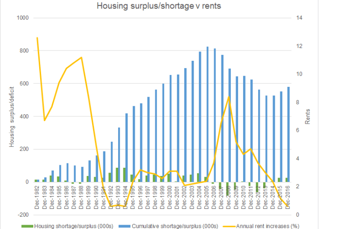
Instructively, the chart shows that growth in rents is as low (negative) as during the 1993 recession. True, much of this is related to major cities and especially Sydney and Melbourne, but this is national aggregate data, so there is at least some smoothing out of regional differences in the data.
On this data, Australia’s doesn’t have a housing shortage. It probably doesn’t have an affordability crisis either. But what that means, is that rental incomes are not pulling their weight compared to the value of housing assets either, as item C. in this grouped analysis indicates.
B. Housing approvals down 8.1% year-ended May
Australia’s dwelling approvals continue to decline, falling 8.1% for the year-ended May 2017, compared with the prior year. Approvals totaled 214,482 separate dwellings for the year, around 19,000 less than the prior year.
For the month of May, dwelling approvals were down 1.5% compared with April.
As the chart below shows, approvals have been falling since late 2016, but the year-on-year declines are beginning to accelerate.

To go straight to the dashboard and take a closer look at the data, click here
As the chart below demonstrates, free-standing house approvals have declined by a relatively modest 3.6% over the last year, falling to 113,691 separate approvals. The large falls were reserved for multi-storey apartments, especially 4+ Storey apartments. Approvals declined 14.6% for the year-ended May.

To go straight to the dashboard and take a closer look at the data, click here
Declining approvals, still underpinned by the base of free-standing dwellings, sees the most traditional form of dwelling increasing its share of the total market – to 53.0% for the year-ended May.
If anything is holding up Australia’s housing market, it is the great Australian dream. When this building boom ends, there will be plenty of new grass to mow and Hills Hoist’s to swing on. Anyone in for a mowing franchise?
C. Housing is too cheap?
Australia’s housing prices are, on average, too cheap, at least for the purposes of sustaining the debt that is being used to finance residential property purchases. That is what LF Economics has described in a briefing titled ‘Is Australian Housing Undervalued?’ For most people in the housing market, it is a strange proposition, and it certainly runs counter to popular wisdom and perception.
However, the argument itself is sound enough, if perhaps too broad to accommodate all of the distinct situations impacting households.
LF Economics comments that with rental incomes having turned down in 2016 (see item B in this grouped analysis), capital growth, more focused on impervious land than deteriorating physical buildings, is the remaining means by which a return on investment can be extracted.
As LF Economics demonstrates, average rental yields for houses and units in Sydney and Melbourne are set out in the table below.
|
Estimated Net |
Sydney | Melbourne | ||
| Houses | Units | Houses | Units | |
| 1.9 | 2.4 | 1.8 | 2.4 | |
With a term deposit rate of approximately 3.3%, to make an economic return on property requires capital growth. That capital growth needs to cover all of the other factors that impact on housing prices also of course. LF Economics has calculated what it describes as the ‘loss cover growth rate’, which:
“… indicates how much the median property has to rise in nominal terms on an annual basis to cover the net rental income loss after the NG [negative gearing] deduction has been applied.”
Comparing the ‘loss cover growth rate’ with the annual change in nominal prices shows that rising prices in Sydney, Melbourne and Canberra cover the losses, but not elsewhere.
Under this scenario, property prices need to keep rising to cover off income (rental) losses, plus the other fees and costs, and of course opportunity costs. Until that happens, the argument goes, Australia’s housing is too cheap!
While this is a compelling macro-economic picture, it is pretty dismissive of the lives of many people, and certainly ignores what we might consider to be the popular perception.
Indeed, modeling and analysis by the Australian Housing and Urban Research Institute (AHURI) indicates that for each 1% increase in real dwelling prices, there will be a 4.7% increase in new house supply and a 3.9% increase in new apartment supply. That is of interest, especially because the AHURI report into housing supply responsiveness in Australia also finds that:
“Most of the growth in housing supply has been taking place in mid-to-high price segments, rather than low price segments.”
It goes on to demonstrate that rather than housing being an upwardly mobile good, where those in lower cost housing move up into higher cost housing:
“…low-income households continue to experience growing difficulties accessing low cost housing. Housing in low-priced segments is presumably more affordable, but less than 5 per cent of approvals were in the bottom 20 per cent of the house and unit real price distribution in 2005–06, and this remains the case almost a decade later in 2013–14.”
So we might presume from this that at least at some levels, access to housing, at an affordable price, is a specific challenge for those on lower incomes. It is not clear the extent to which the general debate about housing affordability is fed by the specific concerns of lower income households. What is clear is that housing affordability for some households, is clearly exacerbated by stagnating wages growth, which is discussed later in this edition of Statistics Count.
But for those who do manage to get into the market, it is a different situation, at least while interest rates remain low. As Core Logic’s Cameron Kusher wrote recently:
“Although an increasing number of households have taken on housing debt, the value of that debt is rising at a slower pace than the value of housing which is reducing the level of leverage across the market (at a macro level).”
So overall, housing values are rising, with debt, driven by lower interest rates, growing more slowly. That is a comfort for now, for those who can afford housing in the first place, especially because, as the data shows, housing is not paying its way, at least for those who are invested in it.
That leaves the lingering question, what happens if rents and prices remain stable (or grow say at just the rate of inflation), and interest rates (and therefore repayments) rise? For more on this, read item D. in this grouped analysis.
D. Australians suffering less mortgage stress, but its all in the interest rate
It might be a case of “Oh really? Try living in my shoes!”, and for some people (see item C in this grouped analysis), that is clearly the case, but latest analysis of the 2016 Census points to less households suffering mortgage stress compared with 2011.
According to the Grattan Institute’s CEO, John Daley, back in 2011, close to 10% of households were experiencing mortgage stress. By 2016, largely thanks to lower interest rates, that number was down to around 7%.
This is a topic worthy of a lot more consideration, especially in the context of a potential (or theoretical, if you prefer) housing surplus. But, lets start at the beginning…
Examining first what we actually know, we can see in the chart below that the value of total loans remained near its peak in May 2017, at AUD26.886 billion, which is 8.6% higher than in May 2016.

To go straight to the dashboard and take a closer look at the data, click here
Owner-occupiers are continuing to win market share back against investors. In May they accounted for 54.2% of the value of loans, with investors falling back to 45.8%. First home-buyers held 10.0% of the total value of loans, pretty much consistent with their best position of the last two years.
So, there is a little movement in the marketplace for home loans, at a headline level, but that data doesn’t tell us overly much, which is where John Daley’s analysis adds value.
Mr Daley points to the typical household and demonstrates that in 2011, approximately 29% of after-tax income was expended on mortgage repayments. That figure declined to 26% by 2016.
While that is good news in general, the main relevant distinction between the two Census periods appears to be the decline in interest rates over the period.
Lower interest rates cannot however last forever, increasing risk in the economy.
At the household level, rising interest rates very quickly become higher repayments, which in turn, increase the proportion of after-tax household income expended on mortgages.
If that occurs, households would likely be more cautious about their expenditure in the general economy. With Australia’s economy focused on the services sectors, economists consider that would flow straight into higher levels of unemployment. And here’s the really big problem with that, as Michael Janda from the ABC described it:
“If people did start losing their jobs, they would be unable to meet their mortgage repayments, thus defaulting, causing losses for the banks, and with forced property sales driving prices even lower with the danger of a downward spiral.”
Couple that scenario with the stagnation in wages being driven by substantial and potentially epoch defining changes in the world of work, and it really does not seem like Australia’s housing is over-priced.
In fact, it makes it seem like household indebtedness is too high and a major risk in the economy. But, it seems less likely that the usual treatment – higher interest rates – will do any good at all.
The issue of wages stagnation – and its potential drivers – is addressed in a later item in this edition of Statistics Count.
")

")
")
")